About this column
Pay attention, class. These tips for writing clear, concise, conversational, compelling copy — optimized for your own ideal client — will be on the exam.
This is an installment of The Voice Bureau’s blog post series on Writing Your Smart, Empathetic Website. This series is written with active and aspiring brand creators in mind — those of you who know that your website should be your business’s hardest working “salesperson” — and want to make that more of a reality. Click here to visit the intro to this series, and to find links to all the other installments.
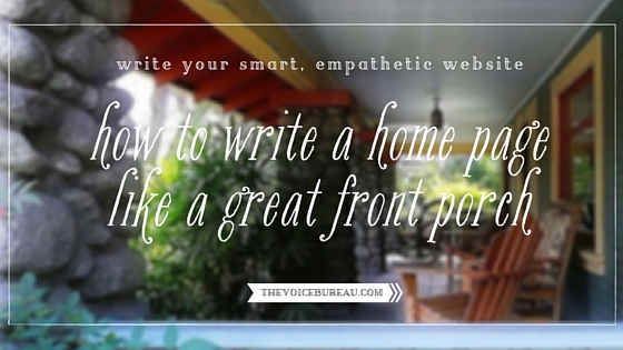
A huge, cool, graciously-appointed wraparound front porch was the stuff of my childhood dreams.
Rather Anne of Green Gables-esque, I know. I longed for adulthood, when yea, verily, I could procure myself a home with such a porch, and thus begin a halcyon 50+ years of casual entertaining, reading late into the night underneath a blanket on a porch glider, and spying on the neighborhood.
Are you a front porch person? Do you like to keep an eye out for neighbors and passers-by, watch the comings and goings of daily delivery trucks, and take in the changing colors of the neighborhood as one season turns into the next?
When it comes to your online home — AKA your website — it pays for every business owner to embrace front porch living.
Door color, stylized address numbers, wreath, porch swing, retro glider, boxwood topiaries flanking the threshold?
Here’s how your home page is like a great front porch. But first, trend cycles.
Web design and layouts go through trend cycles, just like anything. When I first brought my solo-owned business online (back in 2006), it was the Age of the Blog, and it was popular to have your blog landing page BE your home page. No formal home page copy per se, just your freshest writing out front, with a nice header, nav menu, and sidebar to orient people. I bucked that trend and went with a traditional home page for my brick and mortar boutique.
Seven years later (it’s now 2013, for those of you who are counting), blog-as-landing page feels a little passé in the realm of Serious Business (even among solo-owned or very tiny Serious Businesses with a highly personal point of view). It’s not that leading with your blog is wrong (or even amateurish), it’s just that it puts enormous pressure on you, the brand creator, to publish great stuff frequently. And when your latest piece is something that isn’t the most apt reflection of your Value Proposition, you run the risk of confusing site visitors as to what you’re about. Too, it requires your other home page elements to work even harder in terms of communicating what you’re about, while remaining all the simpler, visually, because you’ve already got a blog post going on.
Most of the time, when I get a vote, I advocate for my clients to have a traditional Home page for their business website — one that clearly showcases what the business offers, who the offer is for, who’s behind the offer (if they want to be a visible part of the brand), and how this brand’s solution is the very best for its Right Person.
That’s not asking for much, right?
So back to our front porch metaphor.
A great front porch helps sell a home (ask any realtor). It helps establish curb appeal. It suggests a gathering place — guests to be welcomed, holidays to be prepared for — and homecomings to be had. The front porch starts the conversation — the one the potential buyer is having in her head that goes like this: Oh. OH. I think this might be The One.
Likewise, as a business owner, you have the opportunity to put your brand’s best foot forward, visually, energetically, and situationally speaking. So let’s do it!
Here’s a round-up of important features that every great home page and front porch needs. Take note and see where you could clean up, cozy up, or customize your website’s curb appeal —
Every great home page needs . . . a WORD COUNT LIMIT.
When budgeting for client web copy, we (at The Voice Bureau) allow about 50-300 words for home page copy. (50-150 is often best, for a site on which you don’t want to have to scroll, scroll, scroll).
(This is just like how every great front porch needs to be pared of tchotchkes. Too much going on right when your guests “land” creates a sense of unease, confusion, and disarray. Exactly how you don’t want your site visitors to feel when they land on your site.)
Every great home page needs . . . a POINT OF VIEW.
In business, your Point of View is your differentiator (or Unique Selling Position). It’s what makes YOU and your product or service the best choice for your Right Person. Your point of view must be allowed a chance to be seen and heard. It shouldn’t have to compete with a lot of other signals. A brand without a clear differentiator runs the risk of becoming a magpie brand — a little bit of this, a little bit of that, a shiny object here, a razzle-dazzle here.
(This is just like how every great front porch needs a stylistic point of view, preferably one that complements the architecture of the rest of the structure. What does a point-of-viewless front porch look like? Oh, you know, it’s the one sporting the Americana tin star, the nylon Bambi flag, the pink flamingos in the flower beds, AND French lavender in pots.)
Every great home page needs . . . to be USER FRIENDLY.
A user friendly home page is one with clear and simple navigation. Seven choices, maybe, in the main nav — NOT seventeen (and yes, multi-tiered nav menus, I’m looking at you). A definite Call to Action, so your site visitors know what you want them to do next. Tell them where they should go. And don’t be coy about it.
(This is just like how every great front porch needs to be user friendly — clear walkways, an accessible mailbox, safe steps and railings. Come on, people. Treat your visitors right!)
And finally, every great home page needs . . . a SENSE OF HOSPITALITY.
Don’t use the word ‘Welcome!’ but DO convey that you’re ready for who is likely to turn up (your Right Person site visitor, of course!). Convey HOW you share their point of view, and do it efficiently. Lightly. Without grasping. Do not barrage your site visitors with a bulleted list of “symptoms,” feelings, or self-identifiers. You don’t have to get very far into their heads — in an obvious, hey!-look-at-what-I’m-doing-here! way — on the Home page. But you DO have to connect. And offer the makings of a promising relationship.
(I’m afraid to think about what the front porch version of this point might look like. A bullet-pointed family credo hanging beside the door bell that all visitors “must” adhere to or be banished? Provocative political signs plastered on every available surface square inch?) You know what to do. Be the person you want to be in your brand, right on your brand’s “front porch.” Don’t be that guy.
Thinking of your home page like a great front porch is the first step to seeing how your site visitors — who aren’t invested in your business like you are — will experience it. It’s the most empathetic way to approach the design and writing of a page where hopefully, your site visitors won’t linger too long, because they’ll be ready to click on through and learn more.
In the comments, I’d love to hear:
What helps YOU experience a home page like a great front porch — one you’re eager to step up on to, because you can’t wait to get through the door and see more of what’s inside? What’s enticing or impactful for YOU on a home page?
(Image credit.)
 Hello, you.
{ 12 comments… read them below or add one }
Nothing invites me more into a website than skillfully blended strategic and heart-centered webcopy. Websites relying too much on door-to-door sales tactics makes me want to avoid the owner. Also, I love websites that don’t use too much flowery language.
Thanks for the home page tips! I realized I’ll have to shorten my new landing page and take out the word welcome.
Hi, Kristy —
I’m with you on the flowery language. I tend to be turned off by sites that are overly poetic or amorphous in situating the site visitor. Even IF the site is geared toward self-exploration, personal development, aesthetics, or beauty, I *still* want to know what it’s ABOUT and whether it’s for ME pretty darn clearly from my very first couple of seconds.
What is it about that word ‘welcome’? I think it’s become such a given, so implied, that our eyes (as site visitors) tend to skim over and we no longer see it as part of the texture of a personality or brand conversation. It just feels like a placeholder. Still, it’s commonly used (although I strike it from my client’s rough draft copy whenever I have the chance). ;)
I agree what you’re saying about welcome as a placeholder. I think it’s because so many default templates use the word “welcome!” If we see it now, we feel like the creator didn’t really try hard, and just used what they were given.
Hey Abby, I’m loving this one. It gives me a whole new mindset for designing that page. Creating the homepage in a satisfying way has been the hardest since I removed my first website. But I do remember I succeeded to launch that one time because you got me motivated. This post could help me pass that roadblock. I just realize that it must have been about 5 years back when we started!
Hi, Dewi —
Wow! Has it really been 5 years? Geez — time flies. :)
I’m so glad this post has created some momentum and structure for you. I find, in general, when evaluating new clients’ existing home pages, most people can use (1) more utter clarity around stating WHAT they do [i.e. making the Brand Proposition clear on the home page] and (2) a lot less emotional intensity than one would think.
Looking forward to seeing the next iteration of your work in the world!
This is pretty ON POINT. As a digital strategist, the home page is the hardest page to “get right” off the bat. I usually leave that design for last on a website and even then, I lost count how many times I’ve changed it up. The front porch analogy totally helps put it into perspective!
Thanks!
You’re so right, Vicky — the Home page can be the trickiest, I think, because it needs to be the simplest and yet the most compelling. Ultimately, I find that short, sweet, and clear — with real personality — is the best route. Glad the front porch analogy helps you!
Very informative post! I was under the impression that MORE copy on the homepage was better…
Length isn’t as important as much as is resonance — establishing a credible, trustworthy voice and signaling to the people you’d like to connect with (as customers and clients) that they’re in the right place and it will be easy to get their questions answered by the site.
Thank you. You’ve inspired me to renovate my homepage. Excellent information!
Thanks for reading, Kate! Love your site.
Holy moly, I feel like I hit the jackpot finding your site! Thank you so much for sharing your expertise. I am very much enjoying your voice; it is helping me to find my own.