About this column
Crafting craveable content brings your Right People to your doorstep. Maintaining a consistent content plan keeps them coming back for more. Need some help planning? Our ideas can help you get started, scheduled, and sharing.
When I listen to a client’s brand, even before we’ve put words on the page for it or before there’s a website I can look at, I’m listening for two things: voice and vibe.
Though similar in nature and certainly intertwined, they’re not exactly the same things.
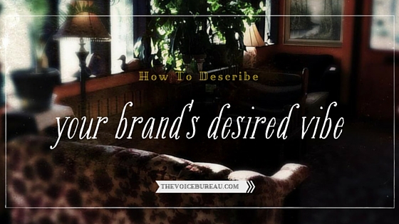
I describe vibe as the energy of the abstract qualities that come through a brand in its suite of signals. Vibe shows up in the design choices: color, typography, graphic style, layout. Vibe comes through the content. Vibe is felt in a business’s relationship with its customers, its readers, its supporters.
But describing your own brand’s vibe, or desired vibe, can be slippery. If you have an existing brand, there might be a gap between what the vibe you want and the vibe you’ve got.
You might have told a designer, “I want edgy, feminine, bohemian, and sacred,” and you might have gotten something else back — something that looked to you like ‘trendy, girly, and witchy.’ A different vibe. You might have sent a designer a pinboard full of colors, textures, and images, but what you got back wasn’t the composition you had in your mind’s eye. Therefore, the vibe was off.
Here are 3 exercises you can do to describe your existing brand’s vibe, or to describe your desired brand vibe if you’re in line for a redesign:
1. Focus on Colors. Where do the colors you love come from, in nature, history, design, art, or fashion? Are they linked to an era, like these Art Nouveau-era colors, or this Midcentury Modern palette? Are they inspired by fashion? Maybe built around a hex code resembling Chanel’s cult-classic nail polish Vamp? Did you derive your colors from a photo you took at a favorite spot outdoors, like, say, Washington State’s Cape Flattery? And what do your color choices SAY about what matters to you and your brand?
2. Filter Your Copy. Reread the most important pages of your site. Read your home page, about page, and service/sales page. Read them sentence by sentence and keep a pad of paper next to you as you read. As you read, write down the ONE most important word in each sentence — according to YOU. When you’re done, review your (long) list. Look for patterns in the words. Are there themes and motifs emerging? Are you noticing something about your brand or business you’ve never seen before in quite the same way?
3. Find Your Right People. Think of your 5 favorite clients so far. Write their names down. For each client, think of 5 words to describe them and write those down. Look for patterns in your list of 25. Any recurring words? Synonyms (different words that mean the same thing)? Really interesting juxtapositions that give your brand texture?
It’s a quick trip from vibe to themes and from themes to content. There’s a bit of a hop, skip, and a jump in there, but we know how to get you from Point A to Point B. Inside our new online course, Run Your Business Like a Magazine, we’ll unpack the magic of getting from vibe to voice on the page — in the form of a content strategy you can be proud of that meets your Right Person’s needs and inspires you to keep creating and publishing.
All the details on Run Your Business Like a Magazine are right here.
In the comments, we’d love to hear you:
Describe your own brand’s vibe, or desired vibe. We’d love to hear the words you’d choose, especially if you’ve done one or more of the exercises described here!
 Hello, you.
{ 2 comments… read them below or add one }
This was fun to read, Abby, because #1 is exactly what helped me settle on a direction for my current behind-the-scenes rebrand. Though for me (perhaps an INTJ thing), design begins with an image vibe more than a color vibe per se, they are related.
I kept trying to come up with an image strategy for my website because I was never happy with how it was turning out. My vibe felt wrong. Too soft. Too busy. Too disjointed. Yet, every time I made a secret Pinterest board and filled it with beautiful images that went together, it still felt off.
Then one day—not sure how it happened really—I realized how attracted I was to Midcentury Modern design and something sparked. I had been trying to choose images based on what I liked, if it went with other images, and if I could envision an image going with some topic that I’d be writing about. When I realized how much I loved a high-end MCM look, I threw out all of my assumptions and began again. First I started this board to see it all together and test how much I really love it. (A lot.)
https://www.pinterest.com/TheCuratedSoul/classy-midcentury-modern/
Then I started researching this design aesthetic and asking why. Why am I attracted to this? What does this design represent now? What does it hearken back to? How does it relate to what I am doing?
As I pinned and studied it all began to gel. Then I was faced with the problem of how to turn MCM interior design into website design and cohesive brand aesthetic while bootstrapping. Not exactly easy.
So I started another secret Pinterest board called TCS MCM VIBE. This time I didn’t pin based on what I liked or if it would go with other images or even a specific color palette. This time I looked for images that *felt* like what classy MCM feels like for me and how that relates to the brand I’m building. Prestigious. Minimalist. Comprehensible. Thoughtful. Focused. Essential. Confident. Capable. Relevant. Self-aware. Connecting what’s inside with what’s outside. Grounded yet Abstract. Privacy *with* Transparency.
Of course, being my age and from Southern California where MCM was born and raised, it’s also a nostalgic thing for me personally, but that just makes it fun for me to work with. My brand likes it for more idealist reasons.
With all of this in mind I worked on that new board. At first I had to ask if the image had a MCM vibe to it, but eventually image searching became pretty quick. It ended boiling down to mostly “Does this feel prestigious and simple?” I found if I asked those questions it was almost always enough to accept or decline an image. The result is that I finally came up with something that vibrated accurately and my image searching has been revolutionized. I think when I relaunch my brand is finally going to feel like my vision, or at least as close as I can get while working alone.
I’m planning on trying your #2 after I rewrite some of the main pages to see if anything new pops. That could be a bit though since I’ve determined not to do any of that rewriting until I am able to relaunch with a buy button.
Anyway, thought you might like to hear that story. I was delighted to find MCM as an actual example in your post! That was groovy, baby.
Susan, thank you for sharing this explication! I LOVE the backstory here & look forward to seeing the brand when it re-unveils. One of the most enchanting parts of branding, for me, is hitting on that initial spark of inspiration, and seeing how it whirls and twirls through the sky of my mind, becoming other things along the way, alighting off of complementary or contradictory concepts, and then becoming a new thing entirely. You’ve described a process here that’s very similar to my own.
Also, I’ve only recently developed an appreciation for Mid-Century style, since moving to Seattle, where the style seems more prevalent & loved here than it does in the Midwest (from my observation & recollection). I love that color palette I pinned & I think it’s awesome that you’re drawing inspiration from the era!
Keep me posted on the eventual re-debut. :)